This Post will help You to Understand the R language in Just ten minutes, so Let’s Dive straight into it:
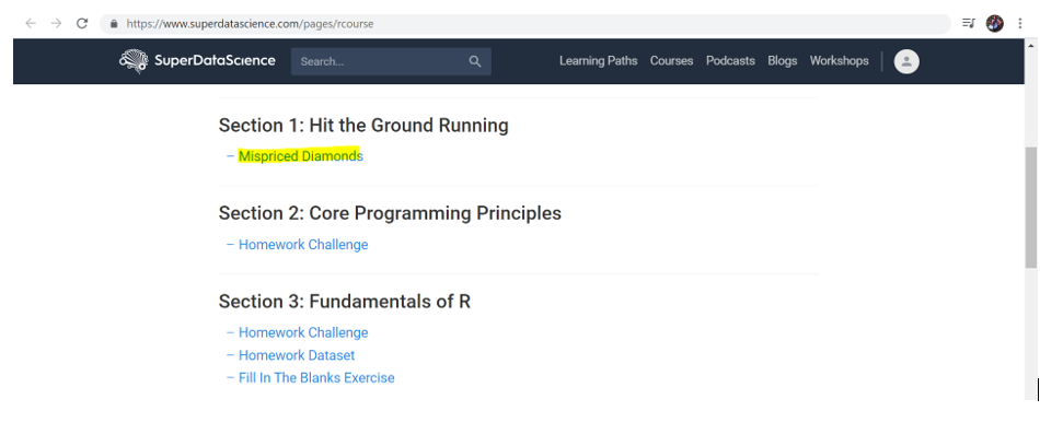
Step1 : First Go to this website : https://www.superdatascience.com/pages/rcourse
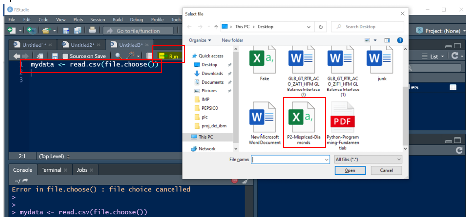
We have some practicing datasets from this website, Scroll Down and click on Mispriced diamonds under section1: hit the Ground Running (Refer the Screenshots attached, follow as per the yellow color Highlights)
Download the excel document in your desktop, we will be using the same insights in our R studio
Step 2: Let’s Explore the dataset
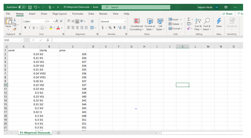
Here this excel contains three columns: Carat, Clarity and Price, each row Represents the Diamond Carats, its weight and price and this data set contains more than 50,000 Transaction data, which is Pretty Big.
Step 3: what are we going to do with these data?
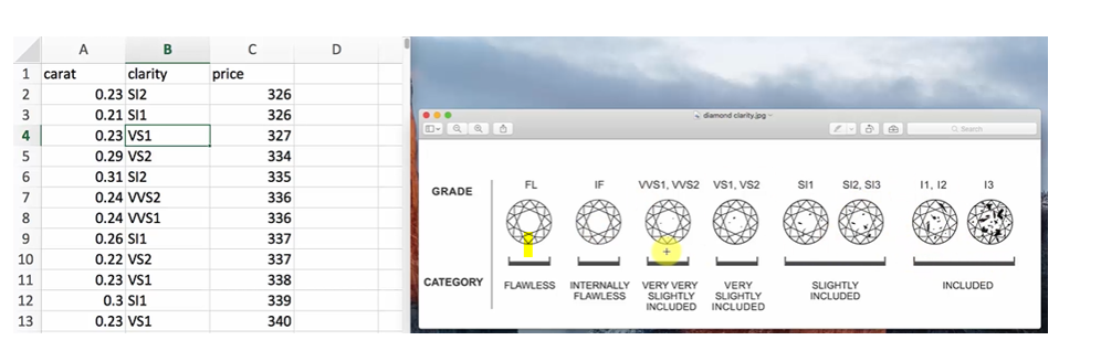
Look at the column Clarity from Excel, there are some abbreviations and these abbreviations are explained in the right-side chart, as we can see there are some inclusions on purity of the diamond.
So Today we are going to investigate is does the relationship between price & clarity always Holds True? Or doesn’t Hold true or is there any mispricing in the market?
Here we will not compare each Diamond Clarity & Price Line by Line, but what we can do is we can check the statistical averages of price and clarity of all the 50,000 Records simply by R language.
Now Let’s dive straight into R studio.
Step 4: Here I will not be explaining all the statements ,commands, Packages & Functions used, we will be going through all the R core programming principles in the upcoming posts.
This example will help you understand the Realtime scenario:
Please refer my Post on How to Install R studio if not installed :
Installation of R, R studio and R Tools for Data Science for Windows and Ubuntu – Sri Tech Studio
Go to start Menu and Type R studio and Open R studio
R Studio has four main panes each in a quadrant of your screen: Source Editor, Console, Workspace Browser (Environment & History), and Plots (Files, Packages, Help). These can also be adjusted under the ‘Preferences’ menu.
The source code should be incorporated in Source pane
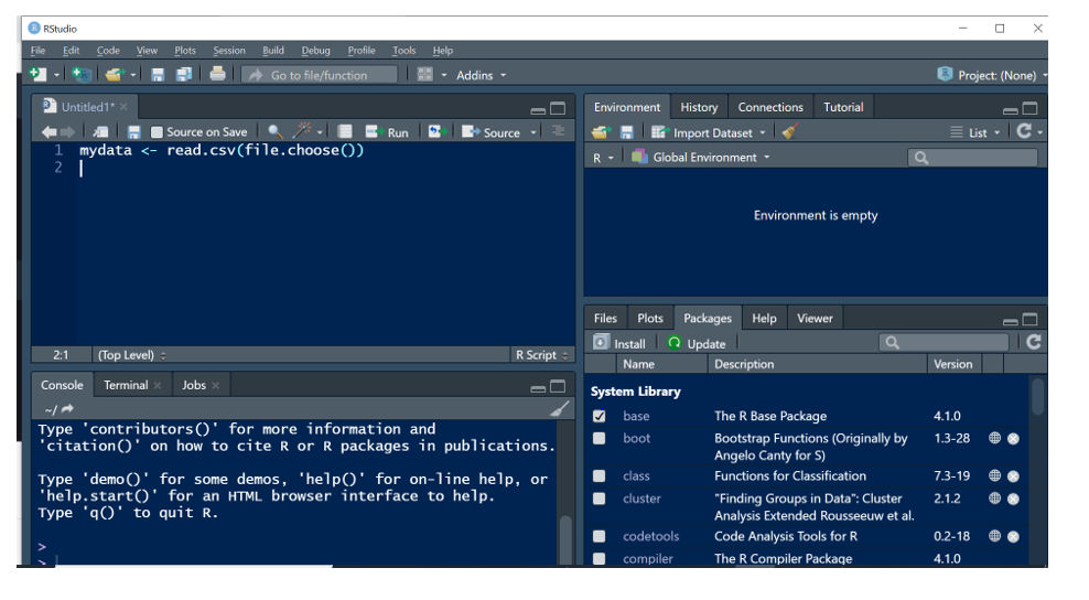
- Write this Code in source pane: my data <- read.csv (file. Choose ())) and Click on Run Button or enter Control + enter to Run the code
- This Code is to read our data from the excel file downloaded in the desktop
- As soon as you click on run button or Control + enter, a new window will prompt you to upload the dataset
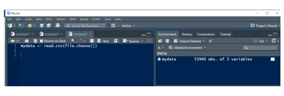
In the Right-side window, we can see the data is loaded, contains all the three variables.
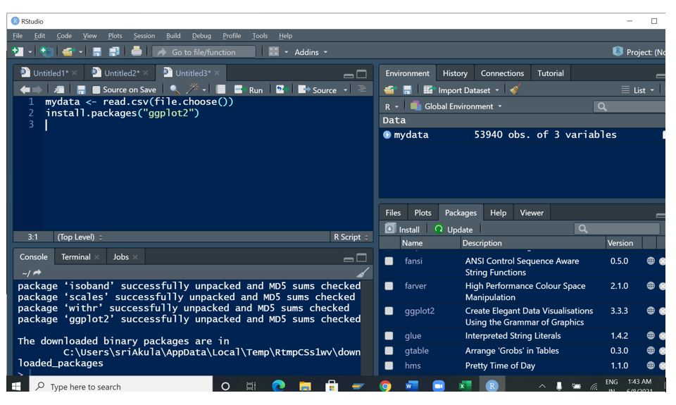
- Now let’s download this package (ggplot2) to Visualize the Dataset
- Write the code: install. Packages(“ggplot2”) and Run the code by clicking on control + enter or Run button.
- Now R studio will download the packages from Internet and install it in your Machine
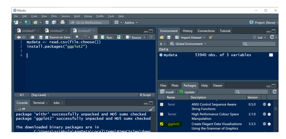
- Once all the components are installed successfully you can see the Installation updates in Plots pane (Files, Packages, Help), in the right-side Bottom pane we can see ggplot2 Package details
- Now let’s activate the package by clicking on check box
- Now we will check the Statistical Data of Carat and Price , to do this : Call the Function ggplot and pass the variables as x= Carat and y = price and we will be creating a scatterplot
- Write the below two lines of code and run the code
- ggplot(data = mydata, aes(x=carat,y= price)) +
- geom_point()
- Here Data is our Uploaded Data, AES is a Function used for graphing elements to specify the desired aesthetics (Color, Lines, sizes, Point shape & Text size), X= carat and Y= Price and geom_point () will show the data in scatter plots.
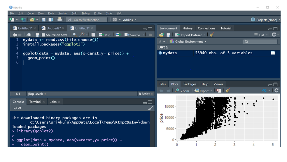
Here the data is seen in scatter plot in Plot Pane .But looking at the Plot, we don’t have enough data to identify the diamond statistical details, so we will be adding our third variable: clarity
- Write the below three lines of code and run the code :
- ggplot(data = mydata, as(x=carat,y= price,color = clarity )) +
- geom_point(alpha = 0.1) +
- geom_smooth()
Here Clarity is taken in color , geom.Point (alpha = 0.1 ) is used for the transparency
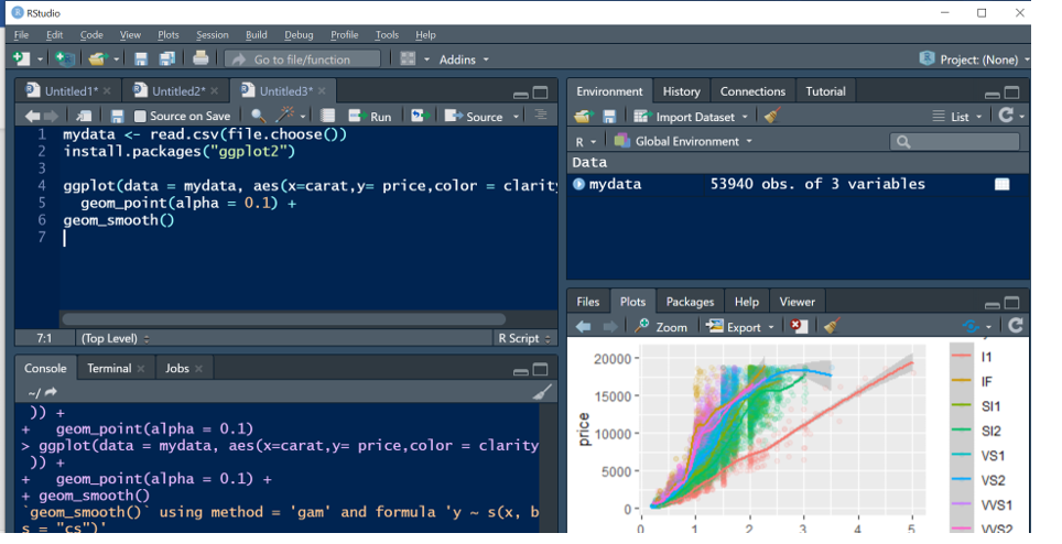
From these Insights Now it is clear that which diamonds are having high clarity, medium clarity, and Low clarity. Some Lines are overlapped because of Market Mispricing .
Hope we have derived a great insight from this dataset, as we understand that R is a super powerful tool, with Just a few lines of code, we were able to build this Beautiful Visualization
Keep Coding… 🙂 Let’s discuss R core programming principles in the next Post.