First check Packages related to qplot function are installed or not
How do we check?🤔🤔
Type? qplot and run this line of code
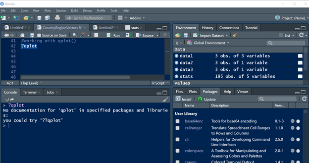
As we can see the information in console pane that No documentation available for qplot in specified packages, so now we are clear that the packages related to qplot function are not installed.
So, let’s first install the package:
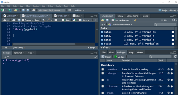
As I have already installed this package, please refer this URL (https://sritechstudio.com/let-take-one-real-time-scenario-to-understand-the-r-language/) to Install the package if not installed.
- I have installed it already so iam using library Function to load the already installed packages.
Use the syntax as library(ggplot2) and run this line of code.
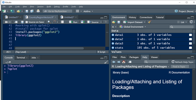
- If not installed, please use this below syntax to install the packages
Now let’s look at the differences between Package and Library
Difference between Package and Library:
packages are a collection of R functions data and compiled code in a well-defined format created to add specific functionality. There are 10,000+ user contributed packages.
The directories in R where the packages are stored are called the libraries.
Hope now we are clear with the differences between Library and Package.
Once the package is installed or Called using Library, Now check the documentation available for qplot or not.
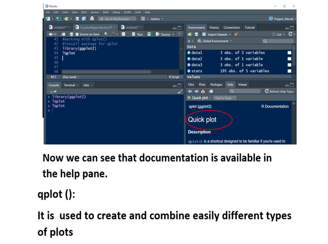
Let’s start using qplot (quick plot) to Visualize our data:
I will be using the same dataset used in my previous post, please refer the below URL to use the Dataset.
(https://sritechstudio.com/demographic-analysis-using-dataframes/)
We are passing stats data to argument called data and where x coordinate = Internet users.
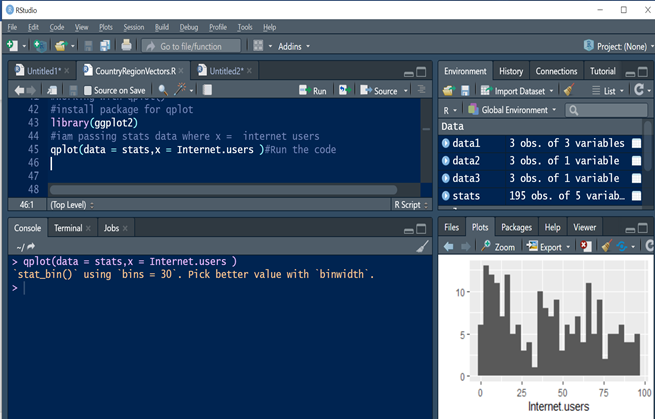
As we can see here the stats data in Plots pane.
Let us plot more data:

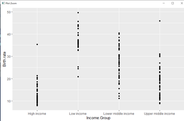
Here there are 5 income groups which are plotted in x axis and Birthrate details are plotted in Y axis.
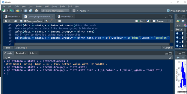
We will Try to Use more properties like Color, size between plot to plot & to display the plot data in Box shape.
Plot data :

Here the Data is Visualized in box plot, color Picked is Blue and size between one box to another box is 3.
Time to do a small task :
Till Now we explored great features and properties of
qplot, Now will do a small task requested by client,
Client requires the Visualization in Plots and data should be categorized by Income Group of the country
Here is the solution to categorize the data by Income group of a country:
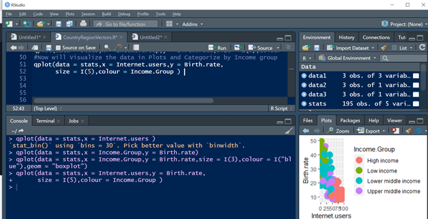
Here in this example, iam passing stats data and Horizontal data is Internet users, vertical data is Birth rate and Income group categorization is done by passing the Income group to color Parameter and size defines the gap or space required for one plot to another plot.
Let’s see data in plot pane:

Now Looking at the data insights, every data science should have an effective Data story telling skills.
What is story telling and why it is important???
Effective Data Storytelling will teach you the essential skills necessary to communicate your insights through persuasive and memorable data stories. Narratives are more powerful than raw statistics, more enduring than pretty charts. When done correctly, data stories can influence decisions and drive change.
I will be posting about Story telling skills in my upcoming Posts.
In this scenario, we should be able to explain the story of the data Insights represented in a Plots.
Let’s tell a small story of the above data Insights:
Here we have four income groups, in an average the high-Income group people Birth rate is quite less, but the usage of internet is near to 70 percentage.
And looking at the data insights of Upper middle income group the birthrate is around 45 percentage and quite less internet users ,and for Lower middle income The birth rate is bit Higher and access to internet is very low and Finally for a low income group, The Birthrate is extremely Higher and access to Internet is very Low.